home
bio
galleries
products
commissions
tutorials
q&a
links
e-mail

Mischievous Joy (stage 5) 

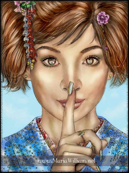
Mischievous Joy (stage five)

Many times I see the entire painting in my mind's eye, colors and all. But it still doesn't hurt to create a color rough to see how it might look. For this, I go for help to my good old friend - the computer! I converted the digital photo of my underpainting to grayscale, and painted away in Photoshop 7. Sometimes it takes me many hours and a dozen different versions to arrive to the color scheme I feel content with, but this was relatively easy. I chose nice complimentary colors, the warm tones dominating to accentuate the mood. Once I was satisfied, I printed out the result so that I would be able to reference from it as I paint.

These studies are always very rough and basic. They're not supposed to be precise or good-looking; they merely help me see what color choices I might want to make when it comes to the actual painting. Since digital colors don't match real-life colors, many times the real-life color scheme doesn't look like the digital one, therefore doesn't work out. But that's the beauty of oils: if you don't like something, you can simply wipe it off and start over, or add subtle layers of color until it looks just right.

I know many traditional artists (if not most) create real-media color studies for their paintings, but I absolutely loathe doing that. I feel lucky to live in the digital era, and I use all the wonderful options it's given me to my heart's content. Perhaps some may feel that it makes it seem like I'm not a serious artist, but it's never really bothered me. As a colleague of mine once said, "I'm not an artist, I just like to paint pretty pictures." Amen.

next
flourish